![[Joe Clark: Design] Joe Clark: Design](design.gif)
![[Joe Clark: Design] Joe Clark: Design](design.gif)
Now with illustrations!
[First published in the “LVI:I” issue of Print, March/April 2002]
Late in the previous century, I wrote an article entitled “Typography and TV Captioning” (Print, January/February 1989) that explored the hamstrung ugliness of closed captioning used to make TV and video accessible to deaf and hard-of-hearing viewers.
Back in the day, closed-captioning, which reproduces dialogue and sound effects in visible words, was limited to barely-readable white-on-black letters with no descenders and very few accents; lines of caption text could be positioned only at screen bottom or top in four-character horizontal increments. To overcome the descender problem, nearly all captions were set in uppercase, deemed less illegible than mixed case.
Then as now, captions are transmitted as a code on the 21st line of the TV picture (normally hidden from view); these “Line 21” captions are thus closed, meaning you need a decoder to watch them. Captions permanently burned into the picture, by the way, are open captions and have never been widespread; foreign-language subtitles have little in common with any kind of captioning.
As an accessibility technique, closed captioning worked, but it was primitive and barely legible. Just how have things changed in the intervening years?
Well, closed-captioning itself is far more widespread. George Bush – a Republican president, no less – enacted a law requiring that caption-decoder chips be built into nearly all U.S. televisions after mid-1993. No more than 300,000 set-top decoders had ever been sold in the entire prehistory of closed captioning; suddenly more than 20 million decoder-equipped TV sets were added each year, making captioning a fixture in hearing people’s lives, too. (In fact, these days most captioning viewers are hearing – and I don’t just mean people watching the captioned JumboTron Astrovision in Times Square.)
Technical standards for captioning had been upgraded in the early ’90s when the first generation of set-top decoders was replaced by a new model line; the specs were updated yet again for the decoder law’s actual implementation, but typography remains seriously deficient. This is what happens when you allow unilingual American computer nerds, unable to learn from their mistakes, to design what is in effect an electronic typesetting system. Decoders still do not have enough accents to typeset French or Spanish, for heaven’s sake. You can now place captions anywhere on the screen (a capability rarely used), and colour captions, always permitted in the captioning spec, now are actually practicable since decoders built right into a TV set have access to its colour guns while consumer set-top decoders do not. (That’s foreground colour; background colour must be black by default.)
Fonts remain a glaring oversight.
In developing the specs for built-in decoders, manufacturers insisted on retaining the right to specify their own fonts. There’s only one font per set, and it is decided upon by the maker of the set. Every TV model can and often does offer a different font, and cheap sets usually have worse fonts than expensive ones even within the same brand name.
And guess what? We still don’t have descenders on all captioning fonts. To put this in desktop-publishing terms, imagine that every printer in your office were a 1980-era Epson with eight-pin dot-matrix fonts. More than two decades after the first closed-captioned test broadcasts in 1979, millions of viewers are still stuck squinting at fonts in which e, g, and s vary by only one or two pixels. Why, I wonder, has nobody simply hired Matthew Carter, designer of Microsoft’s custom-engineered screenfonts Georgia and Verdana, to solve the problem once and for all?
Captioning in Europe, the U.K., Australia, and other countries using the PAL television format uses on a different technology from Line 21 captions. (While a variation of the Line 21 system was introduced in the 1990s, it is used mostly for home videos and its fonts are no better than Line 21’s.) Caption fonts for PAL television broadcasts, using the World System Teletext technology, almost always have descenders and colour has always been used, but it would still be a stretch to call such fonts “designed.” PAL captioning fonts generally lack italics, too, which Line 21 fonts have always had.
In response, the Royal National Institute for the Blind developed Tiresias, a new typeface family, in 1998. The typeface was “one of these things that happen for all the wrong reasons,” says John Gill, RNIB chief scientist. One day, Gill switched on TV captions while his wife talked on the phone and “I decided they weren’t that easy to read.” Gill talked about the font with a friend in the TV biz and was shocked to learn that, two weeks hence, the existing font was set to be entrenched in digital set-top boxes to be rolled out by the millions.
To avert this crime against accessibility, Gill hastily assembled a team (“15 people in it, all of them unpaid”) who looked at 4,000 existing fonts and “liked none of them. They did not meet our criterion for legibility. That is our criterion – legibility, not beauty,” Gill says, implying the two are incompatible. Gill’s specific goal was legibility for visually-impaired people, with or without impaired hearing.
“We did not know enough about the finer points of typography, to say the least,” Gill admits, “and we knew very little about hinting.” Professional type designers, including Chris Sharville and Pete O’Donnell, were eventually included in the process, but the resulting Tiresias family was nonetheless a rush job. Though you can buy the face from Bitstream in variants intended for TV titling (Tiresias Screenfont), computer screens (PCfont), and various kinds of backlit signage (Infofont), what you will not find is an italic. To repeat: A typeface family was designed without italics. In 1998.
Why? World System Teletext captions don’t really use italics, you see; they were not “required,” according to Gill. It’s a staggering omission.
Tiresias is not all that much better than fonts it resembles – Officina, Information FF Info Text, Thesis, FF Letter Gothic – or better than anything else designed recently in which confusable characters like Il1 are readily distinguishable, and all those fonts have the advantage of being full-fledged families. (Tiresias was, however, tweaked to ensure that counters would not fill in and that numerals and punctuation are distinguishable, but other fonts do not necessarily have those defects in the first place.)
Gill says Tiresias Italic, Bold, and Bold Italic are in process, but upgrading a font that’s burned into chips in European set-top boxes will be a tad difficult. For that matter, it will be hard persuading people who bought the font for computer or DTP use to buy it all over again.
Not that there are many such buyers. I’ve seen Tiresias in exactly two uses: A printed instruction manual for a screen-reader program blind people use to make their computer software talk and in DVD “subtitles” produced by the Caption Center, the world’s oldest captioning house. Indeed, in principle DVDs are the biggest thing to happen to captioning in 20 years.
The DVD format used worldwide can include up to 32 streams of what are generically called subtitles. In reality, these streams, or “subpictures,” are bitmaps that can contain anything you want – English captions, Cantonese subtitles, Itchy & Scratchy cartoons, or indeed components of the graphics used in DVD menu systems. (There are, however, severe restrictions on colour usage.) So-called Region 1 DVDs sold in the U.S. and Canada (and apparently Japanese Region 2 discs) can carry conventional Line 21 closed captions; the problem is that computers can also play DVDs, and computers never come equipped with caption-decoder chips that DVD player software can use. To make a DVD accessible, you must use DVD subpictures for captioning; Line 21 closed captions are a convenience.
DVD subpictures allow captioners to use any font at all, pretty much solving the typography problem forever – in theory. The National Captioning Institute, a large captioner with decades of experience doing bland, technologically-backward work, uses Univers 55, and its captions are more like subtitles – typeset centred at screen bottom, with no onscreen placement to tell a deaf viewer who’s speaking and no notation of sound effects (thunder rumbles, phone rings) or vocal styles (whispering, sarcastically), all of which are minimally necessary practices.
Small mom-and-pop titling shops and DVD authoring houses use whatever fonts are sitting around, including Arial, the face that forever besmirched the proud history of the grotesk. The Caption Center’s use of Tiresias is well-meaning but undone by the lack of italic.
But in DVD captioning, all roads lead to Captions, Inc., which essentially owns the Hollywood captioning/subtitle business. Captions, Inc. has an approach to captioning that is at once thorough, precise, credible and viable yet distinctive and even strange, with a heavy use of italics and left-justified text in very long captions – and a lot of them. The firm’s style is so distinctive that I once watched an Ozzy Osbourne music video in which closed captions were so badly garbled that not a single caption came through intact – but I was still able to tell that Captions, Inc. captioned it.
Captions, Inc.’s DVD-subpicture captions are set in a font personally altered by its president “and sole shareholder,” Lee Jordan. The font, he says, is “related to Arial and then I’ve made some changes to it to increase the boldness of the vertical strokes but so as to give a little bit better resolution.”
Except that the resulting font, a humanist sansserif, looks nothing like Arial (that’s a plus) or like anything else, really; it’s reminiscent of Syntax, Andale, and Quadraat Sans. It too lacks designed italics; Captions, Inc.’s DVD subtitles use sloped romans, and the relative positions of words usually are the same as with Line 21 captions, negating subpictures’ ability to typeset down to the pixel level. White DVD subtitles (produced by anyone, not just Captions, Inc.) with no background colour or drop shadow are hard to read; they’re also the norm. Fake italics make things worse, and – can you believe it? – DVD-subpicture titles tend to be either too small or too big.
For more than twenty years, then, at every turn the Romulus and Remus industries of captioning and subtitling have done the wrong thing with typography – and here I really mean typefaces rather than how they are used, an issue of pressing concern to this day. Fonts are rushed into place, hacked at the office, cobbled together by monolingual engineers, or simply built into chips like industrial-quantity vitamins added to cornflakes. Captioning for high-definition television will allegedly be better, but we were told that before when the decoder law kicked in. Meanwhile, the many thousands of DVDs already captioned with unchangeable subpicture bitmaps will remain exactly that – unchangeable.
The many typographic atrocities of recent decades – from grunge fonts to neutral apostrophes – are well-known to designers but affect relatively few people. Yet the persistent, repeated defects of captioning typography impede the understanding and enjoyment of television and video for millions every single day. The next time you cluck your tongue over an illicit use of underlining or a double hyphen in place of an em dash, try reading your TV set for a while. What really needs fixing?
Illustrations adapted from the printed version.
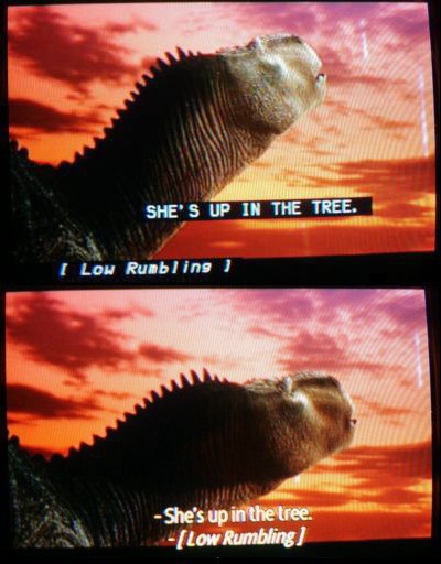 |
In this image pair from Disney’s Dinosaur (captioned by Captions, Inc.), the differences between Line 21 closed captioning (large white-on-black characters; specific caption positioning; primarily uppercase) and DVD subpictures (in this unusual case, yellow characters, with, as is normal, no background; centre-bottom positioning; mixed case) are readily apparent. It’s also apparent that the DVD subpictures and Line 21 captions were created from the same files, replicating the same errors, like spaces within brackets. |
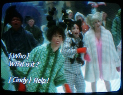 |
In another of its many styles, Captions, Inc. defaults to flush-left typesetting, which indicates a speaker at screen left. (Duh!) Spaces inside brackets, here as in Line 21 captioning fonts, make the brackets look like the word I. It is quite credible to read these captions as “I Who I What is it?” and “I Cindy I Help!” Note also the vestigial spaces before question mark and exclamation point. (From The Grinch.) |
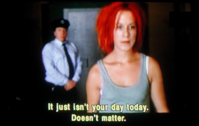 |
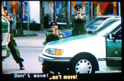
It’s fun to watch a DVD with closed captions and subpicture-based subtitles both active at once. Who’s doing the talking in this case? (The guard, as it turns out.) Why should you put up with any such confusion? |
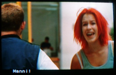 |
Here Lola is yelling “Manni!” even though the word sits on top of Manni; for any other captioner on earth, that would mean Manni is doing the talking. And note the lack of subtitle: It would patronize the audience to render an uttered proper name in type. (The movie nonetheless does it on lots of other occasions. Consistency is not always a hobgoblin subtitlers have to contend with.) |
 |
When do captions and subtitles appear in the same place? When do their texts actually differ? Here, the subtitling convention places all words at bottom centre, while the captioning convention locates everything flush left. Neither convention works. The fact that positioning carries meaning is ignored here; it isn’t enough to tell us the mere text of what is being said. |
Updated 2002.07.21
You were here: fawny.org > Reading the tube
See also: Media access ¶ “Eye-gouging accessibility” ¶ Design ¶ Autonominal Fonts ¶ Typecasting