![[Ten Years Ago in ‘Spy’ (Joe Clark)] Ten Years Ago in ‘Spy’](spy.gif)
![[Reliving one’s formative years of logrolling, short-fingered vulgarians and Separations at Birth] Reliving one’s formative years of logrolling, short-fingered vulgarians and Separations at Birth](formative.gif)
We hereby cast our eye back on SPY, “The New York Monthly” – that exemplar of “irony,” memorably belligerent, bilious adjective chains, and thrillingly recherché typography, from which our entire writing style (and ironic, memorable, belligerent, bilious, and recherché personality) derived.
Where possible, we do actually attempt to stick to a precise ten-year retrospective, but we reserve the right to mix and match.
April 1988
Now with ILLUSTRATIONS thanks to Michael Russell
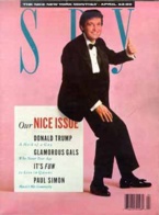
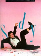
Rifling through my “pile o’ Spy” – and I’ll get back to that catchphrase later – I found, to my delight, a gigantic early ish as yet unreviewed. April 1988, “Our NICE Issue,” with short-fingered vulgarian Donald J. Trump shown on the cover leaning on a layout box of type (and on page one collapsing said box and landing on his top arse).
Auspicious.
Now, inauspicious was the bend I put in this issue after taking extreme measures to guard the issue’s excellent condition. I hate myself when I do things like that.
Substantially updated 2003.02.06. Check mostly near the end.
Advertising analysis
And actually, just on the flyleaf of that page-one illustration is of course the inside front cover. (Another detail of page one [and really, why don’t I just devote a whole section to the cover and its analogue?]: It carries the Spy slogan THE NICE NEW YORK MONTHLY and a cover price, but no barcode, so I suppose it could not really have sufficed if newsagents had bent back the actual cover. Could have worked well as a window display, I suppose.)
The inside front cover is brought to us by the Shaper Image, a determinedly ’80s concept if ever there were one, and pushes... an Aiwa tape player! Everything old is new again.
For people who don’t like to fiddle
When Aiwa asked people what they wanted most from a personal stereo, they heard two things over and over. Not surprisingly, when someone spends $200 [!], they demand gutsy [sic], full-range sound. And right after sound quality came convenience. Couldn’t someone make a personal stereo you don’t have to fuss with?
So Aiwa went away and made the Rechargeable Walkabout [palsied, hamstrung, threadbare shadow of the Walkman trademark sic].... An anti-roll mechanism for flutter-free music while you exercise.
Those were simpler days, the 1980s, when a term like flutter actually meant something. In an age of digital reproduction, with no moving parts except for a spinning optical disc, is it even possible to hear flutter or its big brother, wow, anymore?
Fucking Wellies again. These perverse advertisements, with their squelched condensed bold typography and the perverse rubber product they push, have bothered me for years. I look at these fey knee-high booties and think no wonder the British are mad for enemas. The British, as we know already, are a nation of bottoms. (Andrew Sullivan, come on down!)
Our award for Unabashed Use of a Just-Kooky-Enough-to-Be-Lovable Typeface goes to Crown Royal, which I gather is whiskey or something equally bronfmanian, typeset entirely in Clearface, which I have always loved. The full-page ad on the left side is mirrored by an outside column on the right – a superinventive twist! (“A Crown Royal cocktail! Are you trying to impress me?” “Of course not.” “It’s working.” “I know.”)
Of course, one feels bashful admitting to liking Clearface, if only because its name telegraphs its easy-to-read design rather too overtly, like pulling cans of FOOD out of the fridge in Repo Man.
I was too young to understand the vaguely notorious and contemptible advert for Michael Max Leather. Who would buy leather from a company that missed the opportunity to add an x to the one its name already had?
Who, moreover, would buy leather based on an advertisement featuring a blond model with earrings and some kind of gathered long-sleeved leather halter top and leather miniskirt lying dead on a stainless-steel morgue table? Her two leather-clad friends, one actually wearing a beret (the woman – the long-haired one is the man of the house), look sadly on. Headline: ANOTHER FASHION VICTIM.
(“Art: James Edwards. Concept: Stuart Racey.” You know you’re low-rent when you insist on being credited for “concept.”)
I recall an outraged letter to Spy in a subsequent issue.
In retrospect, I think the actuality of leather production is vastly more gruesome than the affront to the sensibilities of an illustrated advertisement.
“All on videocassette!”
“RKO Warner Theatres Video” is a joke of a company name, but the hed of their ad is its own punchline:
Academy Award® “Best Picture” Winners
Over 60 years[’] worth of the Greatest Motion Pictures ever made – all on videocassette!
Aiwa tape players and The Life of Émile Zola on tape. (VHS or Beta.) 1980s consumerism offered such hope of a rich life of artistic discovery.
How did they make do with so very little porn?
Superspecial filler outrage
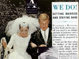 I had an unpleasant memory recur upon reading this issue, bending me out of shape before I bent it. At around page 56 (who can tell where the ad on that page actually belongs?) begins a 23-page
 advertorial “special promotional supplement” entitled “We Do! Getting Married and Staying Sane.” It includes two bind-in cards that impair easy flipping through the magazine (which, in any event, merely bends its cover even more).
(Is the five-page spread, upside-down from the rest of the magazine, that starts with the back cover any less bad? No, because the spread is for “Sisley,” a Benetton subsidiary whose name is virtually impossible to pronounce as two syllables. Give ’er a go, why don’t you?)
I thought this would be the sort of thing Spy would actively lampoon – all the way down to the level of “staying sane” while getting married. (Shouldn’t these people let their hair down, read People, and relax?)
It’s dreadful, particularly in a design sense. But worse, it opened up a 23-page editorial hole in the book that Spy filled with filler. “The New Urban Bestiary, Vol. I: Being a compendium of unusual and exotic modern creatures” by Dean Rohrer, with a woodpecker who wears ear protection and whose nose is a jackhammer and a raccoon who smokes.
Then a map of lakes and bodies of water in Manhattan.
Then an inordinately long section entitled “Is There Life on Outer Boroughs?” whose shell could have been cracked to reveal its sole peanut-like nuggets:
- “Is There Arugula on Staten Island?”
- “There appears to be no bookstore on Staten Island anywhere near the ferry; rumours placed one at ‘the mall,’ 45 minutes away by bus. Life is too short”
- “On Staten Island, Liggett Drugs eventually came through (‘A “C” sponge? You mean a contraceptive sponge? Oh, a sea sponge. Yes, right here’)”
- “Borough Apologies: An Exile’s Primer”
- “The WHO SAYS OUR SOCIAL LIFE IS HURTING? Defense: ‘In fact, we entertain more. People come to dinner a lot. They started coming here as soon as they found that the train ride is not what they thought’ ”
- The RAINBOW COALITION Defense: “We have a Moslem temple right down the street. You don’t find that kind of a mix everywhere”
And of course a truism valid throughout the gentrified West:
It takes a while to explain to someone unfamiliar with real estate that the sale of sun-dried tomatoes within walking distance means an extra $15,000 to $30,000 on the asking price.
No more “pomo” than San Francisco is “Frisco”
I admit disappointment in rereading “A Spy Guide to Postmodern Everything” by Bruce Handy.
The word postmodern used to mean something, in much the same way that prehistory, say, means things that happened in the epoch before history was invented, or that canine means “of dogs.” Postmodern started life as a critical term. First in architecture, then in painting and dance, it referred to works that consciously rebelled against modernist style, often by paying homage to the once-shunned styles and genres of the past.
To college professors and Artforum editors it still means that. To rock critics and slick-magazine-caption writers and wraithlike people standing around the lobby at the Brooklyn Academy of Music – well, it’s hard to pin down what postmodern means to them. It can mean anything that’s sort of old but sort of new, a little bit ironic, or kind of self-conscious – like movies that steal bits from old movies, or photographs of the photographer. It’s used in reference to creative endeavours that never had a modernist movement to being with – art forms such as music videos, rap songs and panty-hose design. It’s culturespeak, shorthand for Stuff That’s Cool in 1988 [sic]. It’s the postmodern (you know what we mean) version of groovy, except that using it makes you sound smart.
Need a user’s manual?
Real-life postmodern stuff: Where is it? What is it?
[Excerpted – Ed.]
Architecture
- Does the building have pilasters or pediments or the same colour scheme as the 1984 Summer Olympics?
- Is it a cube with a peaked roof?
- For a building, is it funny?
- Is it funny but not a Las Vegas Hotel or a fast-food stand in Los Angeles?
- Is it easy to like?
Television
- Do the characters talk to the camera sometimes?
- Does the program have a “look”?
- Does it remind you of an old TV show, only it’s insincere and has better production values?
Interior design
- Was it designed by Daryl Hannah’s character in Wall Street?
- Is there more than one piece of furniture in the room with spheres or other geometric shapes for legs?
- Would you really want to live there?
Movies
- Does it remind you of an old movie, only it’s set in a postapocalyptic wasteland?
- Does it remind you of an old TV show, only it’s insincere and has better production values, and is longer?
Fashion
- Is the garment modular?
- Does it remind you of an old Chanel dress, only it’s ironic and has worse production values?
- Would you feel foolish wearing it outside New York or Los Angeles?
Theatre and performance art
- Does it seem like a parody of something, only without jokes?
- Is it easier than old-fashioned performance art to like, but just as easy to fall asleep during?
Actually, I guess it’s not so disappointing after all.
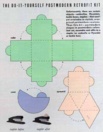 “The Do-It-Yourself Postmodern Retrofit Kit” provides pastel-coloured foldable models of a cube, a pyramid, and a cone.
Unfortunately, there are certain objects – umbrellas, Hyundais, tackle boxes, staplers – that aren’t yet available in stylish, overpriced postmodern versions. Thus this kit – postmodern shapes in postmodern colours. Just cut, assemble, and affix to a stapler (or umbrella or Hyundai or tackle box).
I’ve remembered that line for 14 years.
I loved this magazine, you know.
No. No. I’ll be all right. Just gimme a minute.
From pomo to nomo’: A timeline
- 1964
- Susan Sontag decides that if somebody as smart as Susan Sontag is amused by pop-culture dreck, it must be OK; publishes the essay “Notes on ‘Camp.’ ”
- December 1986
- British Vogue accuses Spy of employing a “mad postmodernist art director.”
Missing the Canadians
I had a roommate circa 1987. I leant him my Spy. He leant it to his gf unit, the same woman he would later be acquitted of stalking. The issue came back without front or back covers and he pretended to be all surprised that I would care. And I no longer have that issue.
That issue included the seminal article “The Canadians Among Us” (January/February 1987). They look like us. They talk like us. Plus of course the winsome Alex Isley touch of a whizzing curling rock as page dingbat. Priceless.
This month’s “From the Spy Mailroom”:
Well, the front page of the January 25 New York Times was certainly depressing – chilling – though it comes as no surprise to Spy readers... CANADIAN OFFERING $4 BILLION FOR OWNER OF BLOOMINGDALE’S, describing the Toronto-based Campeau Corporation’s bid.... Root for the Canadians: Campeau’s principal competition is Donald Trump.
Not altogether serious about the nice part
Spy’s front-of-the-book intro this month fails to live up to its later format of tedious and strained segues from one quirky quote to another.
For more than a year we’ve endured the complaints unflinchingly. You’re so negative, they say. You’re so sarcastic. You’re so nasty. You’re so mean. Sometimes the criticism hurt, we don’t mind telling you. And finally the criticism hit home. It was a blustery, bitterly cold morning near the end of winter. One of Spy’s youngest staff members – Pip, everyone calls im – approached the editors during the weekly meeting at which we select reputations to besmirch and lives to destroy in future issues. “Sirs,” the lad said, voice trembling, “with all the trouble and turmoil in the world today, why can’t we produce a nice magazine for a change – a magazine that celebrates life?” [...]
Before you could say short-fingered vulgarian, the stories that had been planned for April (a funny exposé of the Special Olympics,a cruel prank that involved pretending to give homeless people Central Park South co-op apartments...) were scrapped.
And then the introduction deteriorates into anecdotalist quotation-bridging segue-making. We were going well there for a minute.
En tout cas, I suppose the preceding could be read in a different context as the story of my life.
Again “From the Spy Mailroom”:
Kraig Saunders [no relation] has written from Santa Fe to say that he’d like to see Spy prosper but also to suggest that we “combine [our] vinegar with a restorative.” He adds, “Nobody likes a 100% kvetch.” We dedicate this one-time-only Nice Issue (a low, low 85% kvetch) to Kraig and to all the other lovely people who have ever written to say, more or less, Whoa.
It’s “Aughties,” all right? It’s settled
Meanwhile, at a Manhattan, [I]nc. [What dat? – Ed.] story meeting, editor Clay Felker actually said to his cowed subordinates, “All right, let’s name the nineties.” Then he paused; to the great credit of his staff, no one spoke. “Well, I guess we can’t do it right now,” Felker decided. “Tom Wolfe is busy.”
So that’s where my dim racial memory of this anecdote comes from.
Herbert von Karajan: A recurring Spy trope
Five and a half years ago, when conductor-Nazi Herbert von Karajan of the Berlin Philharmonic came to town, some magazine and newspaper stories about his visit centered on recent revelations about his ties to the Nazi Party in the years before World War II. But not the Times’s. Von Karajan’s manager struck a deal... Von Karajan’s manager? Peter Gelb.
We’ve read this before.
“Again craziness!”
Apparently I missed a seminal Spy storyette on Japanese English malapropisms. And you know, that’s such a novel concept today. But here’s Spy’s follow-up storyette:
Again craziness! For we are flipping the Japanese a second hippopotamus
[Various setup phrases omitted; let’s cut to the chase – Ed.]
- Avant Garde used taste
- Beautiful Human Life
- New York Freak
Fade Out Scene...
I feel that I go to the bottom of night to the end- The Thwack of Scallion
I feel duty-bound to report on the sweatshirt given to me by my friend in Japan. Yes, it did indeed feature a painting of a moose in a surrealized pastoral scene with the heading WILDLIFE PORT EN OUEST DE MOOSE.
Shattering mirrors and greying portraits
“Forever Young” documents, in not-unscarifying detail, the “women of a certain age who insist on clinging to th ruffles and ribbons and hairdos and bows of a long-ago childhood. Just as little girls like to dress up in their mothers’ clothes, feigning sophistication, these women dress down – way down, in children’s clothes, aping girlishness in the extreme.”
Aileen Mehle
Better known by her supremely girlish pen name, Suzy.... To those who insist she hasn’t changed at all in 25 years, she has a ready reply (learned, she insists, from age liar Nancy Reagan): “I could show you some places.”
Shirley Lord
[S]he can still squeeze herself, sausage-style, into green-leather miniskirts – very mod, with her Marlo Thomas hairdo – and would-be romantic, décolletage-emphasizing prom gowns. Newly wed to New York Times columnist–socialite Abe “I’m Writing as Bad as I Can” Rosenthal, Lord also stays young by writing dirty romance novels that prominently feature unsafe sex.
Lola Heatherington, shurely?!
In the aforesaid piece, a gigantically dense column lists women, and indeed men, with cloyingly girlish names – “names more befitting people who collect frogs or have slumber parties than people who consummate six-figure deals and terrorize personal assistants.”
Conspicuously (or at least detectably and readably) mentioned? “Joey Heatherton, actress-singer-dancer-tigress-survivor.”
Later, in “Party Poop” (flat-out superb this month), we read:
ONCE A STAR Shrieks of welcome could be heard blocks away as everyone’s favourite Ewok-ish willowy blond singer–actress–vixen–shut-in–survivor, Joey Heatherton, finally emerged from seclusion to belt out a rousing rendition of everyone’s favourite, “New York, New York”....
Un-British
I don’t talk a lot about Roy Blount, Jr.’s Un-British Crossword Puzzle, no doubt because it’s the most fiendishly difficult crossword ever encountered. And anyway, the payoff is always the solution, where actually solving the puzzle is merely a pretext to launch into tangential exegeses. My favourite was, of course:“...Is Yuppie Scum”
Whoever do you imagine appears in this month’s Letters column?
I did, by the way, locate the bestest solution to a clue in SPY’s Un-British Crossword Puzzle, authored by none other than Roy Blount, Jr. (apparently collected in Camels Are Easy, Comedy’s Hard [Villard, 1991]). Rather than wait till September rolls around again (this Puzzle dates from 1988), in the spirit of giving I’ll hand ’er to you right now.
[W]hen I served for two weeks as a guest columnist for the San Francisco Examiner a couple of years ago, I took it upon myself as a person from Georgia, whence came the case that led to the U.S. Supreme Court’s landmark 1986 sodomy-affirming decision... well, I shouldn’t say “sodomy-affirming.” You will have to bear with me. I hate to introduce into this puzzle a personal note, especially one that may smack of special pleading, but the truth is that I am writing these notes on a computer. I have never worked on a computer before. And my sentences seem strange to me. But that is not your problem. What I was saying is that when I was writing a column in San Francisco, I felt it incumbent upon me to go into the whole matter of sodomy, because I am from Georgia. Which is where Bowers v. Hardwick, the big sodomy case, originated. And here is what I concluded: Sodomy is whatever practice the law considers loathsome. Sodomy is a loathsome-sounding word. Whereas rape has a racy sort of ring to it. So we ought to call rape sodomy, and rename various between-consenting-adults practices after cities other than Sodom. Some possibilities: new yorkery, dallasm, philadelphia, friscolity.
A long time ago, I recall writing a snatchmail that came up with a few similar neologisms. Where did it go? The only one I can recall offhand is stoke-mandeville.
And unlike Roy Blount, Jr., I could not possibly think far enough back to remember the first words I wrote on a computer.
Now, this month, we continue a serialization:
The Worms’ Turn
(Prophetic Novel Begun Last Month)
Chapter Two
Grey was the dawn of January 1, 1991, on Manhattan’s high-rise-overshadowed West Side. In Riverside Park, beneath frost-rimed [sic!] copies of the New York Voice Post News Observer, lay Shandy and Blair Dorian-Letz, a homeless young bisexual bond-trading couple.
Bash the British! One more time!
“Twits for Rent” by Jeffrey Ferry presages the later British issue (September 1993). “A delightfully maternal and hardworking woman named Sue Uda” sells package tours of upper-class twits in their natural habitats.
The first thing you’ll discover is that the upper classes may not have money, but they do have houses.... Anthea proved to be delightful. (The upper classes name their daughters after small dogs or nonspecific urethral infections; they name their sons Charles, Henry, James or Richard – often all four, reshuffling the order for each new arrival.) A small, birdlike woman, she sweetly pretended to find our predictable questions novel and amusing.
“Actually, I have very long fingers”
 Page 44 shows us a twee and abjectly failed effort at parodying an advertisement for Julian Schnabel’s book CVJ. Across the gutter, though, fittingly enough, is a triumph: “NOT AN ADVERTISEMENT” for Trump: The Art of the Deal (“by Short-Fingered Vulgarian Donald J. Trump with Former Journalist Tony Schwartz”). It’s filled with corrosive and damaging pullquotes from actual hacks.
“A public-relations sell from the first page to the last...
– JONATHAN YARDLEY, the Washington Post
Noisy mouthing-off about wheeling and dealing.... He emerges as nothing so much as that prototypical American figure, the hustler. The man’s lack of taste is as vast as his lack of shame.... Parvenu ostentation”“This repulsive book...
– JAMES K. GLASSMAN, the Boston Globe
Oh, Donald, shut up!”
“o’ ”
Circa 1988, I had a friend with a Greek name, despite being Macedonian. (The Macedonian word for “Macedonian” [masculine], Makedonki, has always haunted me, particularly when mispronounced in a broad anglo accent: Makkadonkey.) Short, good shape, interesting thick lined face (presaging a type of sorts I would develop later), impossibly dense jet-black hair, and a biting tongue. Easily the most sarcastic man I had ever met. I loved him to death.
I recall his anecdote of getting his hair cut (I assume I had made some oblique compliment to trigger his retelling) by some chick in “F.-M. pumps” (sic) whose tits rested virtually on his eyes as she lathered him up.
Now. We pigged out on Chinese food (I was not even a vegetarian at the time) and hit Pages in the dim, forlorn hope that the new Spy had arrived. Lo and behold, there it was, in number. “Pile o’ Spy,” he said, pointing.
Yup.
Substantially more than a decade later, after a couple of false starts in which he, like so very many before him, made it clear he found me much too contentious and unpleasant to hang around with, I spotted him in the crowd the night before Pride Day. With a man. “What could this mean?” I asked him grandly. “I couldn’t tell you,” he replied, as his disappointingly plain, overly tall and geeky low-standards-embodying “friend” looked on with a polite smile.
Arsehole. I would have married him.
 This month in Spy, a cartoon by “DDiefendorf” entitled “Gift Ideas with a Difference” includes bundled oblong items labeled Pile-o-Stuff.
You know, it really does all come full circle.
You are here: fawny.org → Ten Years Ago in SPY → Archives → April 1988
Updated: 2003.03.11
See also: Interview with Alex Isley, former SPY art director
