]")

We hereby cast our eye back on SPY, “The New York Monthly” – that exemplar of “irony,” memorably belligerent, bilious adjective chains, and thrillingly recherché typography, from which our entire writing style (and ironic, memorable, belligerent, bilious, and recherché personality) derived.
Where possible, we do actually attempt to stick to a precise ten-year retrospective, but we reserve the right to mix and match.
June 1989
Now with ILLUSTRATIONS thanks to Michael Russell
Like Sands Through the Hourglass, So Are the Days of our SPY
I know I’m living in the past in these pages – I’m all about escapism, stagnancy, and denial of the present day here – but it would at least behoove me to post my monthly analyses of the heyday of SPY on time. Running “Ten Years Ago in Spy” halfway through the respective month ain’t helping anybody, let alone the 35 or so regular monthly readers I have.
(I expect that, were the former fans of the magazine who are now online all aware of the existence of this site, my readership might expand tenfold, but that’s pretty much it. I’m all about addressing diminishingly-small, self-selecting minorities, too.)
I will also eventually have to stop mining the pre-1992 SPY issues and begin documenting the distastefully common pre-Aughties issues, with their smaller pagecounts, lower IQs, and gigantic type. But not right now. Please. Let me grasp my illusions for a while longer.
Liking the idea of
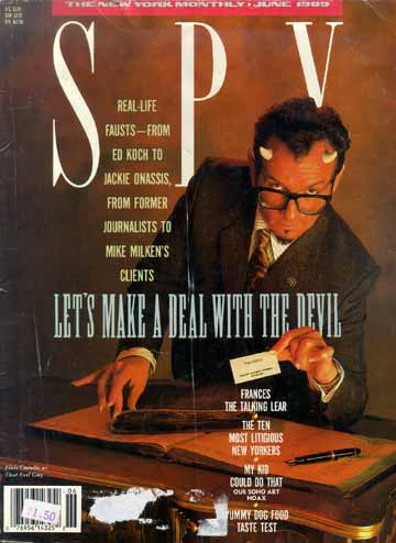
Our cover model this month is Elvis Costello, outfitted in extravagantly fake horns and an equivalently extravagantly fake tan. (Arriviste!) LET’S MAKE A DEAL WITH THE DEVIL announces the cover headline, in a very nice heavily-condensed slabserif. (Which one? Could be a Photo-Lettering exclusive. I’m sure Andy Crewdson would know it right off the bat.) Our devil cradles a meishi in extravagantly fake and overly girlish fingernail extensions that reads
THE DEVIL
New York • Los Angeles • Washington
(212) 832-2000
And the kicker? Dial (212) 832-2000 and you get Donald Trump!
By the way, I do find antlers and horns (hence also fingernails) strange and fascinating. Concrete, the comic-book character, begins to grow them, and in a puberty-like rite of passage, must use a belt sander every day to keep them in check. Elk and reindeer (essentially the same species) grow and lose “racks” of horns – certainly an evocative turn of phrase – every year.
But if I were Elvis Costello, I’d be more concerned with my teeth. As I write this, he’s seen in a blurry, over-enlarged B&W photo in posters sniped up on construction hoardings around town, and his grin is straight outta The Big Book of of [sic] British Smiles. Ghastly!
Calling a ♠ a ♥
“From the SPY Mailroom” this month shows that, roughly once a century, the twee, pallid, constipated, fussy and genteel crystal-goblet demimonde of graphic design can bare a few teeth. (Ghastly!)
Our subject today? “The who-really-invented–New York magazine–and-the–I♥NY–campaign controversy.”
Peter Palazzo of Manhattan recently told us that he was hired in 1963 to redesign the New York Herald Tribune... and that they decided on the name New York at the last minute, and also on the logo that is still being used. We thought it might be interesting to hear how some of the other players reacted to Palazzo’s version of the genesis of New York magazine.
“It’s essentially correct,” says Manhattan, Inc. editor Clay Felker, who is generally regarded as the creator of New York. “But if you want to split hairs, the original typeface was Swash and now it’s a variation on Swash.”
Well, now, hold it right there a minute, fella.
- “Swash” isn’t a typeface. It is a variation of any given typeface (inevitably a serif font, except, I suppose, for Helvetica Flare) with floridly extended terminal strokes reminiscent of calligraphy.
- The New York logotype is set in an obvious Bookman Swash. It may have originally been typeset using an off-the-shelf font (again, Photo-Lettering had and still has an unparalleled inventory of display faces of this nature) and indeed may later have been hand-altered. It still ain’t a font called Swash.
- On the very page on which this declaration appears, we note another reprinting of the Saint Remy La Vie gumdrop advertisement whose headlines are typeset in... Bookman Swash. Cosmic!
Now. You were saying?
“Palazzo’s version may be the case,” says Jim Bellows.... “Palazzo?” says George Lois, creative director of the ad agency Lois/GGK. “I got him his job. He’s one of the stupidest sons of bitches I’ve ever seen. I’ll tell you, that article you ran [October 1988] was fucked up. The magazine was not [publisher John Hay] Whitney’s idea. Palazzo, he’s a real nutcase. Only me and God know the truth. Let me say right now, with my hand on the Bible, I, George Lois, created New York magazine.
“I wanted to call it New York, New York, and make it a combination of The New Yorker and Cue. I went to Jim Bellows with the idea. (There’s another cocksucker for you. I wish they had a lie detector hooked up to him and when it goes off, you die.) We took the idea to Whitney. Two weeks later Bellows came back and said he liked it but wanted to call it New York. But they didn’t want to hire an art director. I said, You got to. I knew Palazzo and convinced Bellows to hire him. I got Palazzo the fucking job after we had the name decided. Twenty years later, what does he tell everybody? ‘I designed New York magazine.’
“The problem started after a seminar about eight years ago. [Former New York art director] Milton Glaser was speaking, and he credited Felker with starting the magazine.... Then Bellows started taking credit for it....
“Mistake I made is, I gave Bellows the comp. Who knows where it is. He probably burned it. Now here I am telling the truth and I feel like a man who has to defend himself, saying that he doesn’t fuck pigs.”
Glad that’s finally straightened out. As for the I♥NY ad campaign, we have in our possession a letter from Larry Brown. Larry Brown the producer... [who] offers “irrefutable evidence” in the form of an article he wrote in 1975 for Ad Age, in which he suggested that New York City needed an “image job” – a notion, says Brown, that “predates by years all other proposals.” Brown also points out that at the time, he was working for Wells, Rich, Greene, the ad agency that eventually did the I♥NY campaign.
[“PR shaman” Bobby Zarem’s] response: “(a) I never heard of [Brown] and (b) he’s a lying piece of shit.... [I]f I never heard of Larry Brown, whoever this asshole is, how could I steal his idea?”
The amusing part? In the current issue of Print, Milton Glaser Himself™ is interviewed on the subject of the slightly-updated I♥NY logotype in use since “nine-eleven” – the one with a bruised heart.
At least she’s visible in a mirror
[Thom Sandberg of Minneapolis] wrote to [then-unconvicted millionairess Leona] Helmsley last November regarding similar-looking print ads for the New York Helmsley Hotel. “You are far too lovely a woman to have to reuse the same photo by flopping it and changing the colour of your jacket.” [...] In December, Mrs. Helmsley replied, “Actually, you should be congratulated! You are one of the first astute readers to have noticed that we flipped the photographed picture in the advertisement... to ascertain the depth of interest our readers take in our current advertising campaign. Apparently, you have a keen interest, as you were able to recognize the intentional flaw.”
Letters. We get lots and lots of letters
Bitch, bitch, bitch!
Now that you’ve broken the ice with homophobic letters to the editor in the December issue, I guess you’ll soon be printing sexist and racist ones. In the meantime, in order to encourage further reader participation, literary gaybashing awards should be made.
“Queer-Aid Chocolate” [an actual brand of Japanese candy] is Caroline Hall Otis’s reference and is the clear winner in the so-hysterical-I-forgot-to-laugh category. In the cute-but-ever-so-subtly-bigoted department, Mark Miller coasts to victory with his insistence that “having a father who starred in all-male adult movies would be less of a stigma than a father who hosted A Current Affair.” SPY cops that biggie well-we’re-liberal-but-not-that-liberal category for its tacit support of hatemongering.
Alan Neff
Seattle, Washington
A bit loud? A bit strident? Well, I mean, this was 1989, the pre-GLAAD era, the we’re-here/we’re-queer/get-used-to-it era, when disproportionate response was the norm. And one assumes this is the same Alan Neff of Seattle who is still writing letters.
I have notes to myself to reproduce a couple of other letters, including one signed “Brett, Jake, and the rest of the gang at GQ,” but I look at them now and realize this is one of those times where what we’re talking about isn’t important, it’s just old.
But an amusing typographic atrocity: Page 24, column 2, line 4 has an errant word space at the beginning of a line. Perhaps they intended it to be an em space. And display type on page 67 lacks a badly-needed Garamond fi ligature.
Atrocious. And clearly only a precursor to a couple of other letters from physics nerds, which contain typesetting depravities like:
- “The correct formula is just E=mgh, where E is in joules, m in kilograms, g=9.81 (M over 3 squared to put in) and h is in meters”
- “The formula for figuring terminal-impact energy is E=½mv 2”
I could typeset math better than that back in high school. (I could also have debugged the first entry for them back in high school. I assume the first nerd’s letter was handwritten and he squiggled an s to look like a 3.) g=9.81 m/s2. And kinetic energy is one-half mv squared, or ½mv 2.
Nerds and ironists: When it comes to typography, clearly an Hatfield–McCoy combination.
In your March Datebook, you have Eisenhower signing Hawaii into the Union on March 18, 1959. Wrong. Ike did it on August 21, 1959. Nice fuckup for a magazine that lists a chief of research on its masthead.
What did take place in Mach 1959, on the twelfth, was the U.S. House of Representatives’ vote, 323–89, in favour of statehood.
Regarding Don Ho’s popularity: He was a hit back when one could still breathe the air in that dungheap of a city you chronicle.
Research this: Aloha, pupule okole lolo malihini.
Ron Jacobs
Honolulu, HawaiiMr. Jacobs is, of course, wrong. We said that on March 18, 1959, Eisenhower signed Hawaii’s statehood legislation – and that’s exactly what Eisenhower did on March 18, 1959. The votes by the Senate and House of Representatives came earlier, and official admission into the union came later.
Our researchers didn’t have time to look into Mr. Jacobs’ closing remarks – they were too busy handling crank letters about imagined errors – so we took a crack at it ourselves. Now, our Hawaiian is a little rusty, but we think Mr. Jacobs is saying, “Greetings, you’d think I’d know better than to put myself in a position where I can be embarrassed publicly for my arrogance – but I don’t!” Then again, we could be wrong.
I’ve only done that a couple o’ times myself. Know-it-all, correct thyself.
Why do I, living 90 miles away, get my SPY after my son, residing 3,000 miles away in San Francisco? ...I’m considering moving to Hawaii. That way, could I get my SPY directly from galley proofs?
Jay Freiburger
Sunnyside, New YorkNo, but you could borrow Ron Jacobs’ copy when he’s done not quite understanding it.
It grates even without a hyphen
Well, I can’t put my hands on it just now, but I do recall a grand announcement from VH1 two years ago that the music channel for aging, superannuated, heavily uncool nobodies with a paunch, a silver-grey beard, a baseball cap, and a man-sized SUV had finally dropped the hyphen from its name. I could wax corrosive over the way illiterates always think hyphens are necessary in alphanumeric constructs, but I will confine myself to SPY, which has been running far too bloody many double-truck adverts for what was then VH-1.
They largely recapitulate the “Perception. Reality” campaign for Stolling Rhône. This month, “The generation that dropped acid to escape reality... is the generation that drops antacid to cope with it.”
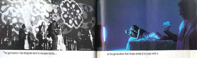
Oh, I just love this. We are shown a Peter, Paul & Mary concert or moral equivalent as the BEFORE state, and another of the spectral, dystopian tableaux typical of this campaign as the AFTER. In a room with no furniture save for a bed, a shapely woman lies face-down in a silver lamé negligée, twiddling her blond hair and facing her man with a knowing smile. He’s a complete nebbish, in an unbuttoned white business shirt and ugly glasses, staring quizzically at a tumbler of effervescent white liquid with an expression more along the lines of “So this is what cold fusion looks like!” rather than the more appropriate “It said to wait two minutes. Is it two minutes yet?”
What’s a nebbish like this doing with a babe like that, apart from carefully setting a stack of fifties on the (invisible) dresser for her to pick up on the way out?
The spooky part comes from the television set at the foot of the bed, which, as in all these ads, beams into the room a brilliant blue light – and no picture whatsoever. It is rather trite to describe televisual pictures as a “blue glow.” (You want blue? Try looking at an expanse of white on an Apple-brand monitor. Just try it. Compare against any other monitor. Do you feel lied to?)
In a previous advert, the spectral blue-glow anteroom contained a shirtless father cradling a baby. Cliché, anyone? And mama looks on, quite uninvolved and irrelevant, as if this were The Handmaid’s Tale.
What hurts even more is the insipid typography, which I suppose aptly matches the gormlessness of the VH-1 audience and the nebbish in the shot. Yes, Helvetica Condensed, with as much flavour and personality as boullion from a can.
 |
 |
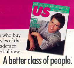
One also enjoyed the ads for pUs magazine, with a cover shot of Tom Cruise (substantially more hair on his head) and the slogan “A better class of people.” Pimple, shurely?!
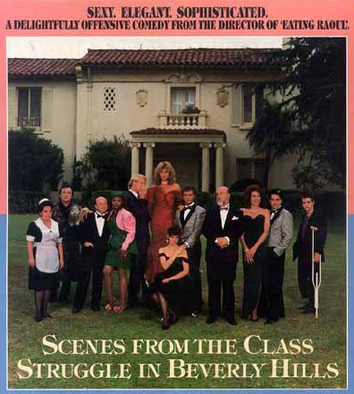
And could anything be more superclassy than typesetting the display copy for the immortal cinematic masterpiece Scenes from the Class Struggle in Beverly Hills in Tiffany, the classiest typeface there is? (Admittedly, it is useful and does have a right excellent italic, as do American Typewriter and Friz Quadrata. The problem is they are all misused.)
“The Curse of Joey Adams’ Tomb”
 This one is delightful. SPY compares the halftone likenesses of newspaper columnists (Cf. the Rorschach tests in the Daily Tubby), some of which have all the resolution of Lite-Brite. But nearly everyone looks far worse in real life. Ick.
But in “The curse in reverse!” Jeane Kirkpatrick looks better in real life than in caricature.
Ten years down the line, SPY’s superexclusive series of mini-interviewettes with David Duke, the Republican Klansman, look too much like easy setups. Perhaps the genre has been simply overused in the intervening years. The giving of enough rope to hang oneself does not guarantee longevity of interest.
“The New Intimacy in Sales & Marketing”
Would anyone dare do this today? Isn’t it outright fraud? Two of four surreal examples by Andy Aaron:
Actual message left on my answering machine in Los Angeles in July 1987:
“Andy – it’s Mark, duuude. Call me back, 976-5633, duuude.”Had I called this stranger back, I discovered, I would have been connected to a “rap line” and charged $2 on my next phone bill.
Personal note clipped to an advertisement for a get-rich-quick book, sent to me by mail in February 1989:
“Andy – This worked for me. You ought to call. –
Bob D.”I phoned “Bob D.” soon thereafter. “I got a note from Bob D.,” I said, “and I was trying to remember if he’s a friend of mine.”
“Oh, that was just a marketing strategy,” replied a spokesperson for Bob D.
Work it, doll!
“You Are There!” this month – which, you will recall, puts every celebrity action figurine together in not-quite-compromising positions – reads:
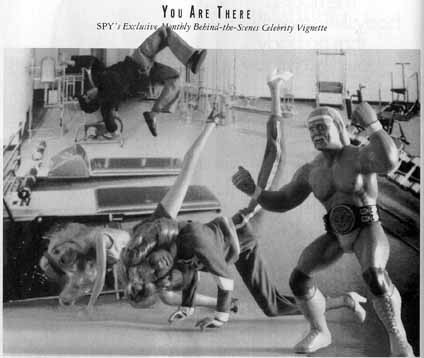
Work it! Work it! And burn the buns! Burn the buns! Former Charlie’s Angels Cheryl Ladd and Farrah Fawcett strapped on their favourite Spandex for some fancy footwork – make that thighwork – to benefit out-of-shape, beans-and-rice-loving immigrants from Central America. Led by ærobics buff Hulk Hogan, the gals contributed their time and estimable exercising talents to a star-studded workout video (distributed at Salvadoran refugee centres), the sales of which will underwrite more celebrity videos for the underprivileged. But who’s that overhead? It’s star-turned-director Paul Michael “Starsky” Glaser, who, as usual, had to “do his own thing.” While the gals were happily doing the hydrant, Glaser indulged in a little free-form Jazzercise!
Worth it for the double-truck spread alone
Another of those well-executed SPY stunts: A Turkish Amerikanski writer enlists in the Turkish army. “Inaccuracy alert: Fez worn for illustrative effect only” sums up the feel of the piece, which documents the events that transpired after a SPY correspondent paid $9,200 to spend two months training as a recruit. How do you do it?
If you’re writer–editor–bon vivant–Turkish buck private Melik Kaylan, what you do is this: Keep a secret diary and pray for a desk job.
The opening spread is another of the many triumphs of SPY graphic design (aforementioned ligature and errant-space defects notwithstanding). Our art director of this époque is the late, lamented B.W. Honeycutt. But the interstitial illustrations (HOW TO MARCH IN THE HORRID TURKISH SUN; HOW TO CARRY A BURNING-HOT GRUEL POT; HOW TO PRESENT UNDERWEAR FOR INSPECTION) were slightly too small and slightly unfunny.
And Kaylan sure as heck looks miserable photographed in the much-discussed blazing Turkish sun.
SPY by-products
As a contributor to the historical record, I feel obliged to document “No Wonder They Call Me a Bitch” by Ann Hodgman. “How does dog food taste? There’s only one way to find out, and it doesn’t involve a talking dog.”
Feel free to cringe. Or retch.
- “Dogs love real beef,” the back of the box proclaimed proudly. “That’s why Gaines-Burgers is the only beef burger for dogs with real beef and no meat byproducts.” The copy was accurate: Meat byproducts did not appear in the list of ingredients. Poultry byproducts did, though – right there next to preserved animal fat.
- There was a horrifying rush of cheddar taste, followed immediately by the dull tang of soybean flour – the main ingredient in Gaines-burgers. Next I tried a piece of red extrusion.
- Every time you open a can of, say, Italian plum tomatoes, you infect them with invisible particles of byproduct.
- [T]he four Cycles really were different from one another. Cycle-1, for puppies, is wet and soyish. Cycle-2, for adults, glistens nastily with fat, but it’s passably edible – a lot like some canned Swedish meatballs I once got in a care package at college. Cycle-3, the “lite one,” for fatties, had no specific flavour; it just tasted like dog food. But at least it didn’t make me fat. ¶ Cycle-4, for senior dogs, had the smallest nuggests. Maybe old dogs can’t open their mouths as wide. This kind... was also the only one to contain “dried beef digest,” a mysterious substance that the Purina spokesman defined as “enzymes” and my dictionary defined as “the products of digestion.”
Throw another wimp on the barbie here. Good thing I’m veg.
You are here: fawny.org → Ten Years Ago in SPY → Archives → May 1989
Updated: 2002.05.31
See also: Interview with Alex Isley, former SPY art director