
Let’s automatically slap a Chyron on top of another Chyron without even checking if the coast is clear first!
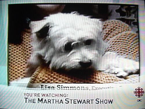
It’s particularly egregious here because the CorpseChyron™ is covering up Martha Stewart’s custom typeface, Archer, by Hoefler & Frere-Jones (rave). I had luncheon with the lads one day and they showed me the memo approving the design, complete with classic handwritten inscription “OK – MS.” An historic artifact, surely. If you want, I can dig up the podcast I listened to in which Tobias pretty much trashed every other slabserif in existence. As a staunch defender of Serifa, City, and Icône, I was outraged.
And you know Vitac clobbers both of these Chyrons with captions, right? (Captions for a show like this should be at screen top, two lines max.) To reduce boredom, I haven’t bothered with photos here, but I put one up on Flickr.
This posting included the following topics, each of which triggers pique and vitriol among readers of the Tea Makers.