]")

[Skip to the article]
Is this indeed the very first issue of Spy? I think it might be.
I won another eBay auction for a pile o’ Spy. It was vastly too much money. Or so I thought until I began to sort through an entire new booty of this precious magazine. (And it’s not as though I can’t get the money back: Look for an auction of duplicate issues in the near future.)
Owning the first issue is kind of important. I will hereby let readers of Ten Years Ago in Spy in on something of spiritual importance. Like every writer with an interest in culture, I sample from sources. They become part of one’s own personality, like reciting books Fahrenheit 451–style.
Here is one of those sources. The Gilda Stories – Jewelle Gomez’s novel about a subject that seems like a punchline of political correctness, a black lesbian vampire – rewrites the vampyr myth as every retelling must. Here, when a new vampire is created, the creator must ensure the new vampire has a supply of the home soil, the earth of his or her birthplace, which is then embedded into the walls of your dwelling and sewn into the hems of your garments. (Bit of a logical gap in that one: Won’t it turn to mud in the washing machine? It’s not enchanted; it’s just dirt.) It provides protection and roots you to the earth – your true source, as you are no longer human.
I had a literal image of home soil since I am from Prince Edward Island, whose iron-rich dirt is a memorable red. But my true home soil is my set of papers: My writings (an ever-so-pretentious term, but I am pushing 400 published articles, plus an eyeglazer of a book); my letters; my research materials; my magazines; my typography collections; my surprisingly few books. I need an enormous investment in filing cabinets – and containers that don’t outgas – in which to store them properly, but they’re here and are stable and all that is a necessary thing for me.
So I feel I am replenishing the home soil by buying up, in however a scattershot way and at however inflated a price, my missing Spy back issues. The day will come when I have them all. How many additional evil spirits will they then ward off?
1986: I was still in Montreal, and there is no way on earth I would have known about Spy. I loved my newsstands (there as in Toronto, large magazine shops were found in every downtown neighbourhood), but I definitely didn’t notice Spy. I did not know the magazine existed until I moved to Toronto.
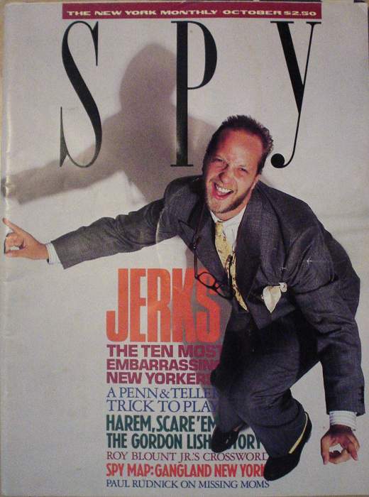
Back then, C-tier comedian Chris Elliott had hair. Or at least was less bald. It will be conceded I have always fancied that balding-hairy-blond look of which C. Elliott is exemplar. And here he is on the cover, supposedly acting as exemplar of something else, “Jerks.” His grey herringbone suit, yellow tie and kerchief and matching socks, and ridiculous loafers look just fine to me, or at least not jerklike. And his “Ayyy!”-style expression and body language aren’t jerklike enough, in my opinion.
This will hardly be the only detail Spy will not have properly worked out before launch.
Somebody sure as hell didn’t know what he or indeed she was doing in typesetting this issue. The art director is listed as Mark Michaelson (who?), and the fabled “Not Miles” Drenttel Doyle Partners are “design directors.” While many components are present, supremely important details are completely flubbed. I have the virtue of hindsight in so declaring, of course, but that doesn’t make it untrue.
 Heds. What is this, secretarial desktop publishing? Since when do Granjon caps in the same size as body copy constitute headlines? (And make up your minds whether you want lifeless and ill-conceived centred headlines or the occasional left-justified ones.)
So what had they gotten right straight from the word go?
 Logotype. Essentially unchanged. (They even slice the top third off in the table o’ contents and obscure it behind the masthead.)
The whole thing is way too cluttered, with a terribly ill-conceived grid and hideous typographic colour in places (“Naked City” especially). The magazine gives an inchoate impression of its future postmodern design, but, seen 18 years later, it’s like David Bowie’s alien species reconstructing the fine print on aspirin tins from having seen their TV commercials half a galaxy away.
Essentially, we’re dealing with the Tracy Ullmann Simpsons rather than the animated-in-Korea Simpsons.
Nonetheless, Spy managed to sell a full complement of ads for its maiden voyage.
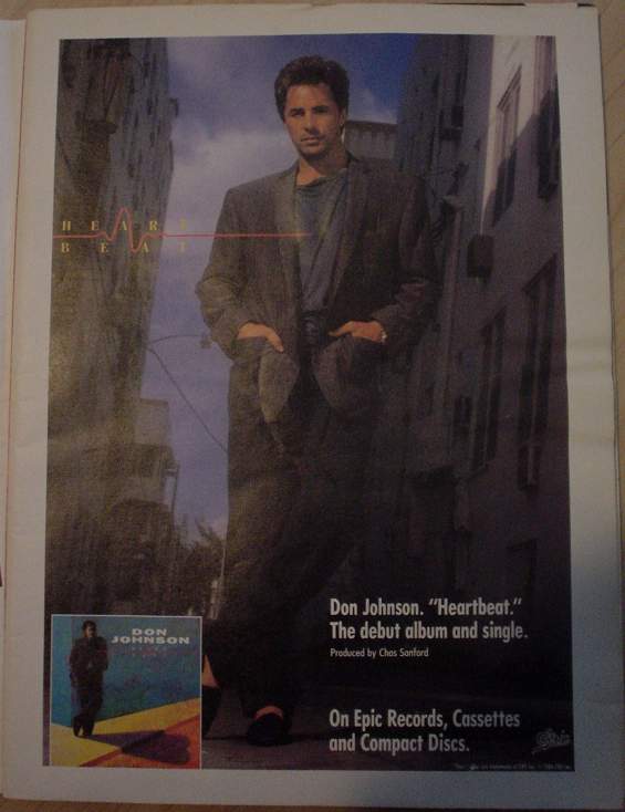 Talk about hitting you over the head right away!
The very first advertisement on page 1 of the very first issue of Spy was for...
Don Johnson. Heartbeat.
The début album and single.
I kid you not.
And a weird observation about the proverbial Chinese wall between editorial and advertising: Like the running heds for “Beginning of the End,” the Heartbeat advertisement illustrates that word with... an EKG readout!
 Early on in the ish we find an incomprehensible B&W advertisement bearing a large photo of a typically-sleazy-looking guy in his 50s leaning over a Ferrari.
The designer and the Boxer
We photographed fashion designer John Weitz... and his Boxer. The “Boxer,” of course, is a twelve-cylinder Ferrari “Boxer” BB512i, one of the most dazzling automobiles ever designed and one of the fastest.
John Weitz has always been a man who understands other men and their hobbies and interests... because he shares them! This is how he stays one of the world’s leading men’s fashion designers and why men trust him. He always seems to be in the picture.
And that is it. There is no other copy or explanation.
John Weitz was a real designer who died on 2002.10.03. A reminiscence of his life chews the scenery:
I remember John Weitz very well. First of all, the men’s fashion designer, who died of cancer recently, was so darned handsome.
I could remember him just for being so good-looking.
As a woman on the fashion beat covering both men’s and women’s collections for many years, I could get a bit giddy facing this tall, dark-haired man with what sounded like a British accent. He was dreamy to look at, with chiseled features and a movie-star aura.
He knew it. But that was OK.
And he was nice to listen to. That affectation in his speech matched perfectly his very deep voice.
One imagines this writer, Barbara Cloud, riding shotgun in the Boxer on the open road in – hell, let’s go Magnum, P.I. and say in Hawaii somewhere. Grappling her wildly-flapping scarf for dear life in overmanicured nails, Ms Cloud smiles gamely as Mr. Weitz hollers bons mots her way over the roar of the wind.
The photo in the advertisement (what is it advertising?) recalls Blue Velvet: “You’re so fuckin’ suave.”
And speaking of fashion: On the very next page (conclusively unrelated) sits a double-page spread clumsy even by the standards of today’s snarky kids who hate anything old. “American Harvest,” it reads in sickening Bookman swash (a Photo-Lettering exclusive?), “fields to explore, dreams to share, a romance without end, sophisticated sportswear with the emotion of America.” (America has but one emotion?) “Designed by Henry [‘Not Hansel &’] Grethel.”
One of the more bizarre novelty fonts of the 20th century, Belwe (with its distinctive little flag-flapping-in-breeze horizontal tail on the rightmost strokes of w and y), makes an unexpectedly appropriate appearance in a Stolichnaya vodka advertisement – at about 14 point. Amazing.
But, I’m sorry, I can’t hear or read the word “Stoli” without envisioning a close-up of Terence Stamp in Priscilla trying to order a shot of vodka in the outback. And no, I can’t find the full scene transcribed, just the famous money quote about blowing one’s box apart.
Hammacher Schlemmer... cool enough to advertise in Spy? I guess so, even though their wares seem scarcely more evolved than sea monkeys, let alone Sharper Image Tag Heuer watches, Aiwa “Walkabouts,” or Tarzan Panasonic TVs.
- Personal Environment Sound Machine
- The most advanced sleep-aid device available. Exclusive [thick, rock-hard] pillow speaker enables you to use it without disturbing others.... plus multi-frequency white noise, produced by a unique solid-state micro circuit. Mask unwanted noise which can disturb sleep or interfere with concentration.
- Turkish Towel and Bathrobe
- ...We decided to offer a Turkish bathrobe and towels, for example, only because in a village in the Ægean region of Turkey, we found robes which are hand-made in the traditional manner. These robes and towels are of ½-inch high-looped pile [and not, presumably, ½-inch-high looped pile] that is woven to 52,982 loops per square yard (far more than other robes and towels generally available in this country). At 19 ounces per yard, they weigh 40% more than others, yet are completely machine washable.
If your washing machine can handle 140% of its usual load, I suppose. (And “19 ounces per yard”... how wide is that towel, exactly?)
These days, we would outsource to India the quality-assurance job of assuring exactly 52,982 loops per square yard.
Speaking of fonts (and, later, of printers), just how bleeding-edge was it in 1986 to typeset the two lines of copy in your 1986 restaurant ad using ImageWriter dot-matrix fonts? (New York and Geneva, apparently.)
Did it make up for the grainy, out-of-focus failed-homoerotic photo of the shirtless man, complete with fake rebate on either side? Or did it make things worse?
Last month’s screamingly funny Harry Shearer prank included this snippet concerning Palio, the Italian restaurant:
- Palio [who?]: Superman, the jacket
- “Don’t photograph me or the Sandro Chia mural,” the bartender hisses.... “It’s the only jacket we have left,” the coat-check woman apologizes. “If it makes you feel any better, Christopher Reeve had to wear this one the other night.”
But a mere two years before, Moira Hodgson dined with Spalding Gray (“Gary Spalding”), who
is not really at home in fancy restaurants.... We met at the bar in Palio, an elaborate new Italian restaurant on West 51st Street. A gigantic, red Sandro Chia mural of the Palio horse race is wrapped impossibly around the upper half of the walls. The Palio festival in Siena, centering on a dangerously frantic horse race that dates back to the Middle Ages, appealed to Spalding’s sense of adventure.
Gray would have 18 more years to live. As of this writing, many assume he is dead by his own hand.
The article continues, raconteur-style:
When the captain arrived with the wine list, Spalding wanted something white.
“Orvieto,” suggested the captain.
Spalding, who has had a lot of therapy, was feeling a little confrontational. “Why do you say that one’s good?”
“I know the wine. I drink it.”
“Why do you drink that as opposed to some other?”
“Because it’s very good.”
“And you’ve tried them all?”
“Yes.”
“Are you the wine steward?”
“No, I’m the captain.”
“What’s the captain do?”
“I take care of everything.”
[...] Surrounded by all this expensive grey, black, and beige, it’s impossible to forget that you are sitting in a $140 million, 54-storey insurance building. Physical blandness has seldom been wrought so expensively....
Our places were laid with enormous brass plates, like gold records, with various Palio colours painted on ceramic in the center. The busboy took the plates away.
“Hey! Excuse me!” Spalding called out. “Why did you do that?”
The busboy looked puzzled. “Don’t you want to eat?”
[...]We talked about... a grant to hang out in the streets of L.A. listening to talkers, and writing a book about guilt and neurosis.
“So many of my monologues have been about that, about not being able to enjoy myself,” he said.... “I feel that I am divided into two parts. I have always been afraid that the killer part of me would jump out of the window while the life part of me was asleep.”
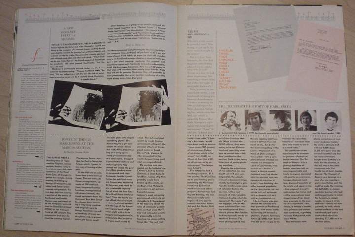
“Power ’N’ Things: Markdowns at the Marcos Auction” by Marilyn Suzanne Miller sits consistently within our later expectations of Spy’s classic You Are There! pieces. Yes, she showed up at the auctioning of “a portion of the estate of Ferdinand and Imelda Marcos.”
The Commission had also devised the catalogue legend – “The Marcos Estate: Auction the Past to Serve the Future,” which, I guess, is one way of looking at the past.... The rest were... sound equipment from the Marcoses’s East 66th St. townhouse disco (including a sing-along machine with original tapes by George Hamilton)....
...the Philippine government’s art adviser, Kenneth Linsner. (Linsner’s most intriguing professional activity is advising the U.S. Department of the Treasury about the value of criminals’ possessions, so that when the T-men rush in to seize assets, he presumably is to be found on the scene, yelling things like “No, not that table – that table.”) [...]
One of the most-publicized lots was the needlepointed discotheque pillows that Imelda had had specially made on Madison Avenue.
I believe that, up to this point, the phrase needlepointed discotheque pillows had never been uttered by a human mouth. This alone augured well for Spy’s future.
I mentioned “Letters to the Editor of the New Yorker” the other month. Well, Spy planted the seed early: The very first issue contains a squibette (“ATTENTION NEW YORKER READERS” [sic]): “You’ve read an entire piece of New Yorker fiction, straight through, and you want to tell the world. But you can’t.... We’re here to help. Spy is offering space in this magazine – valuable space that could have gone to generous advertisers – for your letters to the editor of the New Yorker.”
Tad Friend (who?) sharpens his poisoned pen and uses it, like so much chalk on a subway-advertisement placeholder, to take Keith Haring down a notch. Sort of like what happened to his T-cells.
He had unexpectedly entered a world where kitsch made stars and stars made kitsch, and where no one knew or particularly cared which was which, or what Brooke Shields meant when she said, “Keith is as nice as he is talented.” [...]
Like a charmed town drunk, Haring attracted a ragged band of street kids who tagged along wherever he went, unashamed. He was rich and famous and everyone liked his work, or said they did. [...] Haring painted Madonna’s jacket and Grace Jones’s body. If Haring heralded anything, it was a muddled symbiosis between the worlds of pop music and pop art. [...] He was fashionably antisocial and deeply socialized, and the press delighted in describing the polite fillips he aimed at a society that responded by pulling out its che[que]book.
Yes, well, fine. He was simple and lovable. Simplistic and lovable, no less. I bought a hoodie (the term as yet uncoined) from the Pop Shop circa 1990, a desultory and instantaneous experience. (You had to pick out its number from the wall, where items were nailgunned on display. The bored African-American cashiertrix simply handed you a pre-polybagged garment and you paid her.) Just the other week I bought The Keith Haring Diaries used. Still unread.
If I’m not mistaken, my dead friend Ross and Ross’s dead bf unit, Félix González-Torres, were friends of K. Haring. I recall their saying what you saw is what you got.
But what precipitated Haring’s eclipse was not so much the suspicion that he hadn’t prostituted his art, but that he had nothing to prostitute. The art critic Robert Hughes has it right: “People will look back to Haring and say, ‘So that’s the kitsch people were buying! Good heavens!’ ”
“The Ten Most Embarrassing New Yorkers” is unbylined and its last column runs right off the bleed of the page (love that graphic design!). It’s also dull. Rex Reed deserved a better skewering than this sincere and accurate dose of broccoli:
Rex Reed ♥ New York, and that makes the rest of the country think New York loves him.
Reed’s... [p]raise is even more horrid – his positive reviews sound like the overblown testimonials of an unctuous Judy Garland fan after hoisting one too many kir royales at the piano bar. Rex Reed makes a living writing sentences in which nearly every word is ungrammatical, awkward, or wrong.
Better than being trimmed cleanly off the bottom edge of the page, I’d say.
Anyway, Leona Helmsley:
From our velveteen prose to our zircon tiaras, we like to think we’re giving out-of-towners the kind of high-class experience they’ll never find at home – like me, for example. That’s why you’ll always find a picture of me just across from William Safire’s column in the Sunday Times Magazine – like the one right opposite his discussion of the word vulgar on August 24, for example.
Mee-ow.
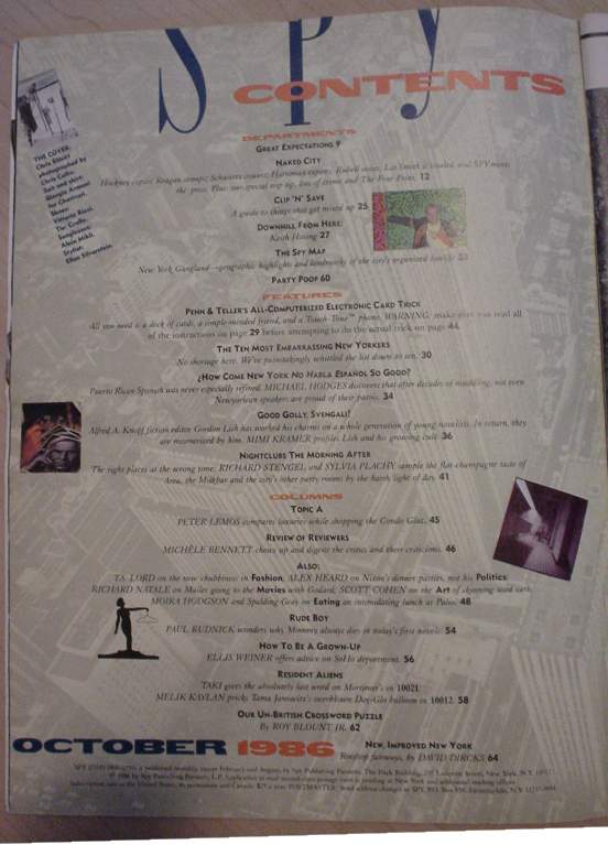
“How Come New Yorkers Don’t Habla Español So Good?” by Michael Hodges presages Spy’s later habit of writing far, far too long. And this one’s only three columns over two pages!
[T]hese optimists-cum-apologists contend that the ability to jump back and forth between English and Spanish actually requires an unusual level of bilingualism, and may give the speaker greater precision and subtlety than would be possible in either language alone....
Angelo Falcón, the founder of the Institute for Puerto Rican Policy Inc., was raised in Brooklyn speaking what he calls “survival Spanish.” He cheerfully admits that when he took a course in Castilian Spanish at Columbia University, “I got creamed.” Perhaps as a consequence, he’s not about to put up with “some guy from Spain in a beret” lecturing the New York barrio about the quality of its speech.
The next sentence ends with “go fuck himself and get a new beret.” A bit trite, that. And I wouldn’t call code-switching of this sort an “unusual level of bilingualism.” That’s what bilinguals do.
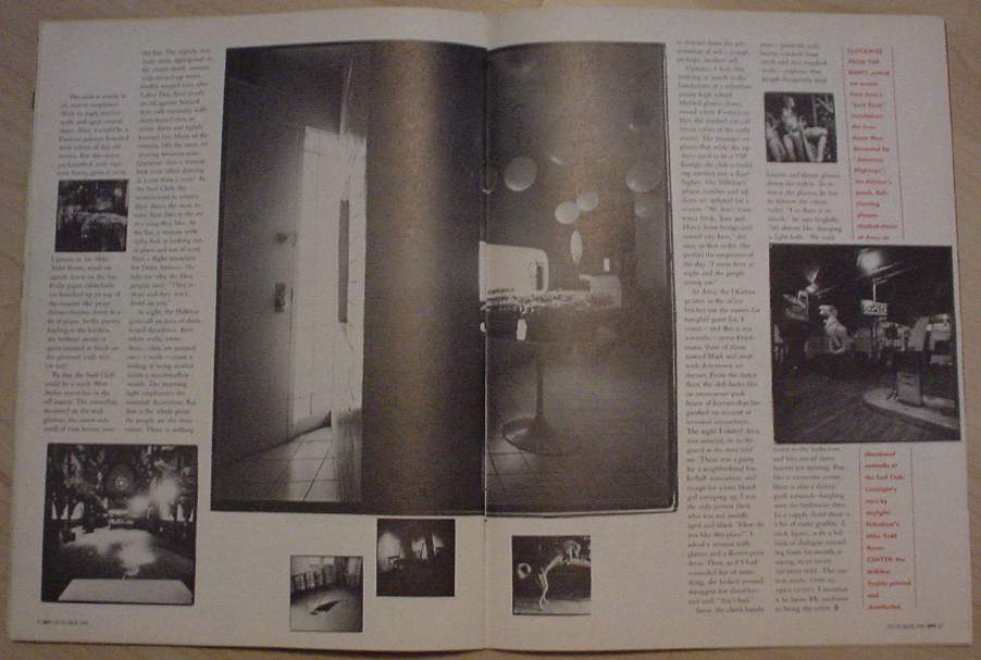 Totally classic article – “classic” as in “still of avid interest 18 years later, and probably 18 years hence” – by Richard Stengel entitled “Night Clubs: The Morning After.” Shot by Sylvia Plachy (Adrien Brody’s mom!), it’s a documentary look at nightclubs come daytime.
The thing that shocks me is how undepressing they are. (I try to imagine local Toronto homosexualist establishments at 10:00 A.M. – and can’t.) There’s not even a whole lot of detritus and garbage to be swept off the floor of Limelight. The strange part is the atmosphere of separation: Rather like purgatory, inside a nightclub come daytime you’re isolated and confined from the rest of the universe.
Now, I read this and I think of the legendary nightclubs of 1980s New York. It’s the power of the press, really: You keep reading about these places, which are merely bars, but they assume mythic proportions, to employ a catchphrase. You buy the Village Voice every week and you keep very much abreast of what’s happening where. (You bought the Voice one week in Montreal with the last actual $2.14 you had in the whole world.) You imagine these “clubs” – a term reminiscent of the 1978-era Live It Up segment on Régine’s – as being located in surreally vague neighbourhoods (all you know is “Manhattan,” or “Downtown,” or, latterly, “Meat-Packing District”). You imagine these “clubs” are filled with uniformly exceptional people you would never find anywhere else doing what could only be done in New York.
Upon reaching adulthood and visiting these actual bars (some, at least – I had well-connected friends back in the day), the truth becomes apparent. These bars are holes-in-the-wall that merely put a new face on a rental property that’s been in use for decades and that will be reused by someone else later. The bars absolutely definitely have a geographical location – complete with inconvenient cab rides to and from there (bar X is “a $20 cab ride from anywhere”); adjoining buildings (not even “neighbouring,” adjoining); uncaring passersby walking blithely past this locus of mythos; overly-loud music; a cover charge; and far too many smells to handle all at once. The “exceptional” people are all from Ohio and made it up as they went along, as émigrés to New York ever must, and what they’re doing in New York can be and is replicated somewhere else. I mean, my non-spouse and I actually get bored of flogging demonstrations at the Black Eagle now.
Plus – and this is admittedly post-facto – I recall the after-screening discussion, at the 1998 homosexualist film festival here, with those two ingratiating manager–directors Fenton and Barbato. They were in town talking up Party Monster the documentary, which somehow later became a feature film. Those two single-handedly gave New York nightlife a bad name by glamourizing its demonstrably worst denizens. “Klub kidz” took the first word in that phrase a bit too seriously, as we learned from the case of Alig and St. James, unctuously glorified and excused by the dynamic apologist duo. One of them actually had the gall to say he was conflicted in his sympathies for Alig and had trouble laying blame. A guy in the audience, showing unusual chutzpah for Toronto, fired back right away that he didn’t have any trouble at all.
I also flash on the scene from Parting Glances:
- Betty
- I don’t suppose you know about silly Cecil running off.
- Michael
- God, that’s awful. Listen, you can cry on my shoulder anytime.
- Betty
- Heavens! I was thinking more in terms of going out and having a good time! Have you heard of this club called Area?
(Sort of the Irish philosophy, really. Go out and get hammered when somebody croaks.)
And speak of the devil: The Spy piece contains the following technological cœlecanth.
At Area, the Okidata printer in the office belches out the names for tonight’s guest list. I count – and this is not scientific – seven Friedmans, three of them named Mark and most with downtown addresses. From the dance floor, the club looks like an amusement-park house of horrors that languished on account of terminal unscariness.
Wow, this is 1986. “Review of Reviewers” was already in the magazine this early on, and Michèle “Not Ignatz Raztwikzwizki” Bennett writes:
Dog-day sloppiness got to the Times Sunday Book Review editors as well. They apparently hadn’t considered the grudge factor when they published Katie Leishman’s ludicrously harsh review of David Black’s book, The Plague Years, based on his National Magazine Award–winning article about AIDS for Rolling Stone. It seems that Leishman’s AIDS piece for the Atlantic had been up for an NMA, too, but in a different category. She didn’t win.
Further in the back of the book: T.S. Lord asks the musical question “Whatever is a FATGIRL to Wear?”
If a fashion role model like Kempner... decided to put on a few pounds – Cybill Shepherd and Kelly McGillis can’t fight this fight alone – imagine what might happen. Women with curves could sit in the open, maybe even at Le Cirque, and eat chocolate mousse. They wouldn’t have to suffer the smirks of anorexics pushing dry asparagus around their plates. It would be a whole new era. It can happen! Only one major obstacle remains. What will they wear?
Divine’s castoff muumuus?
(Or Ricki Lake’s, at least?)
Sadly, the maiden voyage of HMCS Spy scuppers with a pair of dullsville cultural commentaries subhedded “10021” (“Mortimer’s: Watering Hole for our Social Betters,” actually by Taki) and “10012” (“Free the Tama Janowitz Slaves,” by Melik Kaylan).
I was pleased to find “The Un-British Crossword” and especially “Party Poop” already in place in the first issue, but boy, were the latter’s knives ever dull.
As great New York lady put it [sic], people who need people are the luckiest people in the world. As another great New York lady put it, life is a cabaret, old chum. [...] The recent round... had a decidedly River Oaks air – a splashy Texas bar and grill, a de Menil bash.
“A de Menil bash”? Chronicle of Spy’s serial correspondent foretold?
And thus began the odyssey that led you here today.
You are here: fawny.org → Ten Years Ago in SPY → Archives → October 1986
Posted: 2004.02.14 ¶ Updated: 2004.05.25
See also: Interview with Alex Isley, former SPY art director