
A quick traipse down a kind of graphical Memory Lane.
I recall this one didn’t last very long.
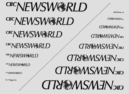
This one may be more familiar. Is it the origin of CBC’s use of Frutiger as typeface?

What may be harder to remember is that this is a bastardized version of the original, which merely kept the broken up-and-down wave going where the exploding pizza is now. It was a flowing N flowing into a flowing W. You can see a vestige of it at Old Farmer’s Wikipedia.
Too clever? Too high-quality for Canada? Too nonstupid for somebody? I don’t know. I would love to hear from whoever designed the original (I have asked around, to little avail) or who altered it.